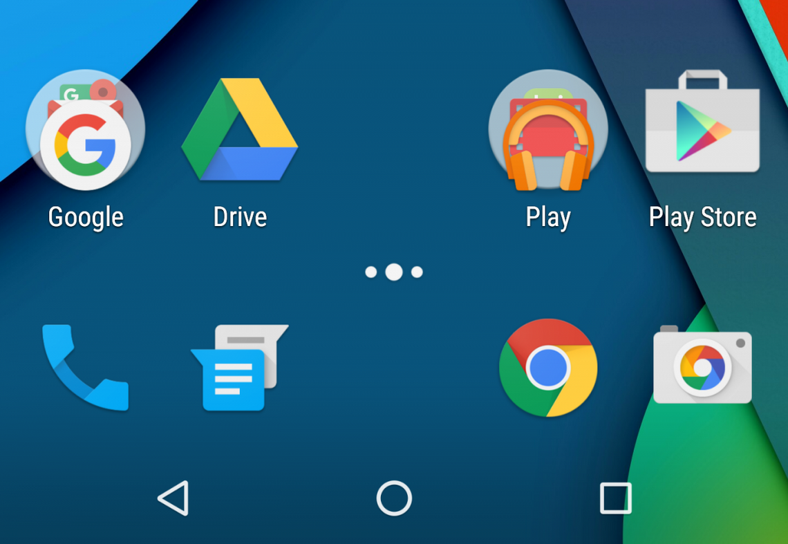
The App Drawer, something so simple, something so native to Android but yet something so controversial as of late. If someone asks about the differences between iOS and Android this is typically an early mention, so when LG (and Samsung to a lesser extent) released early models of their new flagship phones sans-App Drawer the Android community was in an uproar about such a controversial move.
In fact, LG actually made it a point to release a new video in which it was shown you can install a secondary LG launcher from their store to add the drawer back and Samsung removed the “Galaxy Labs” feature from most US variants hiding any mark of their attempt at treason.
But is it so bad? Well I am here to tell you that I have gone app drawerless for months now. I have lived to tell my story - Emperor Duarte has spared my life so far - and here is why we should maybe put our pitchforks away and see that maybe, just maybe it isn't so bad after all... with some tweaking.

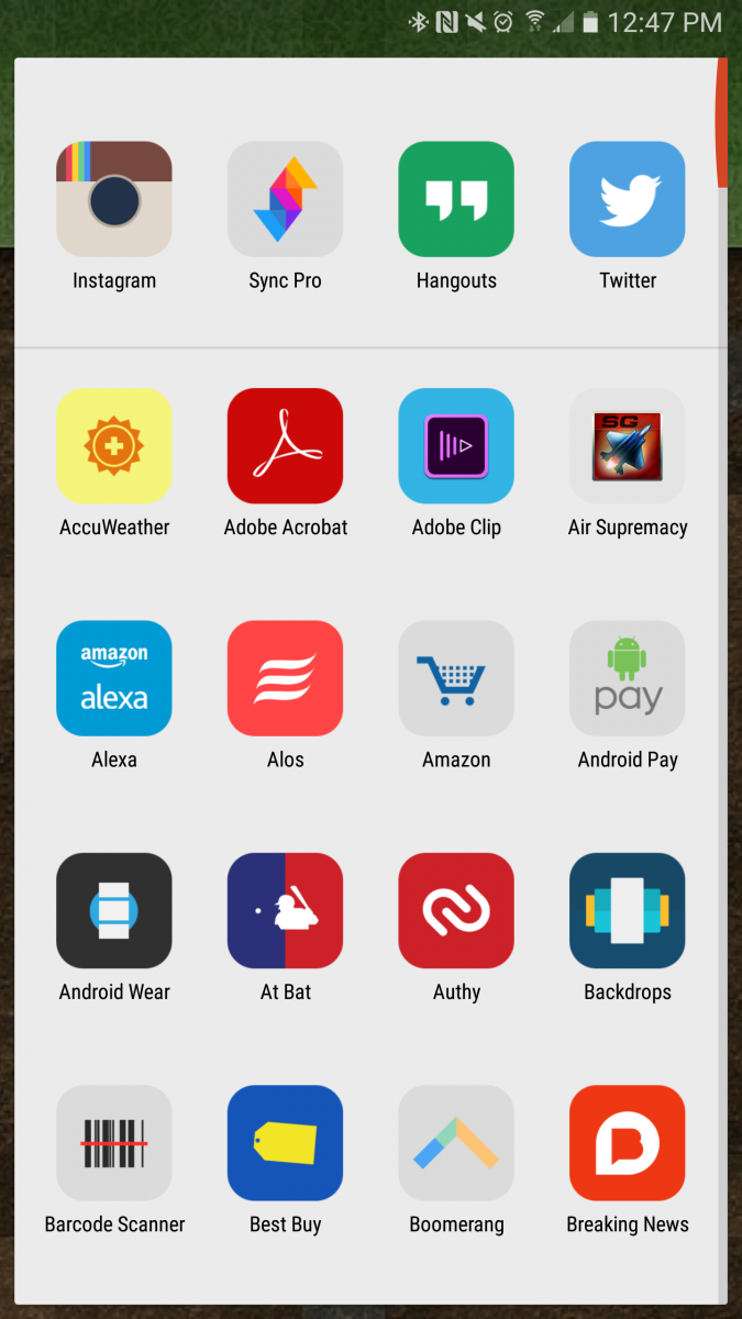
First, some background. The Springboard - Apple’s name for its launcher - is not all that different from the Android home screen. Both dump newly installed applications into a single pre-sorted location, Apple does it by cluttering your home screens with various app icons sorted by install date and Android dumps it into the alphabetically-sorted and seemingly-unending App Drawer. Both solutions get to be problematic when you eclipse 100 applications (a level I exceed shortly after initial setup) for their own reasons. When using Apple's method, the app you just installed is at the end of what could be 5 pages and with Android you have to scroll down while attempting to recite your A-B-C’s to remember what letter ‘R’ comes after.
 In their default states both solutions leave a lot to be desired, especially if you are OCD (me) and like to have things at your fingertip with as little thinking - or singing - as possible, and trust me no one wants to hear me sing my A-B-C’s.
But I found a solution, and I think it is marvelous. On iOS I got by with putting applications dumped into folders, Games, Apple Junk, and Everything Else. This eventually evolved into a folder layout that was categorically sorted, Games had their folder as did Finances, Photography, Shopping and so-on. As time went on and these folders started to populate I found a few totally unscientifically-backed things. I used a larger variety of applications more often, I used the app instead of the mobile site more often and I found myself getting to what I needed faster and with less thinking.
I recently switched my daily driver from the iPhone 6S to the Galaxy S7 Edge - which I am loving, thank you for asking - and wanted to bring this same feel to Android. What I ended up with was something far more powerful than I could have ever done on iOS and something that I think can make even the most die-hard App drawer aficionado (do those exist?) a little curious.

My layout rests on three things: a custom launcher, icon packs, and hidden folders. My most often-used applications are housed on the main screen but some are cleverly hidden folders. Things like Listening, Home and Store actually double as folders. Single tapping on Store opens the Play Store, but swipe up on it and it expands a folder that has the Galaxy Apps store. Home is actually a folder, tap it and the folder opens, swipe it and the first listed application opens. I also hid the Google Search bar since it didn’t quite fit my layout. In its place I have a Google Now icon where the App Drawer button usually sits, a tap opens Now and a swipe expands a floating search bar. My second page is full of categorized folders with an icon set to denote what is in the folder giving it a single cohesive look and feel. I utilize these tricks and power user options from Nova throughout my home screen to nest and combine things into a logical order.
In my opinion the Springboard layout is superior to a single “junk” drawer in that it surfaces apps easier and increase engagement and Apple holds it back and gives it an awful name with its lack of customization. But combine that layout with the power and customizability of Android and you can have a truly awesome and logically superior layout.
Below are a few tips based on my home screen, I challenge everyone to try it for 15 days. Backup your current layout and set aside 30 minutes to setup your screen like mine and see if you don’t enjoy it, even just a little bit. Leave your comments, thoughts, tips and favorite icon packs in the comments section below!
- To create a hidden folder just create a folder and then long press on it. Choose “Edit” and then change the icon. You can also set it to a swipeable folder by setting that option and choosing its action.
- If you own Nova Prime you can download Tesla Unread to enable badge icons
- Set Nova to auto add installed applications to the home screen.
- You still have an App Drawer, mine is set to a double tap anywhere on the screen. Sometimes the auto add doesn't work properly.
- Long press on the home screen, go to Widgets and then add a Nova Folder to add multiple applications to a folder at once.
- The best icon packs include those folder icons, otherwise you can use any icon as the folder front.