Designing for the user is a practice widely accepted and followed in the design community, and while it seems to be a fairly straightforward declaration, diving into it proves that that task is substantially more daunting than it seems.
Users everywhere have different tastes, different expectations, different reactions to certain stimuli, different environments et al, and when these factors come into play, the playing field gets more complex.
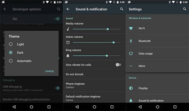
However, first impressions are lasting ones, and one of the first observations that the user makes, immediately after clicking the icon, is the theme of the app, i.e., whether it follows Light UI principles or Dark UI ones. Depending on a number of factors, the app's theme may appeal to the users or furrow their brows, and in the case of power users, it's more often the former than the latter. Why, you ask? Well, here are the major factors,
Contrast

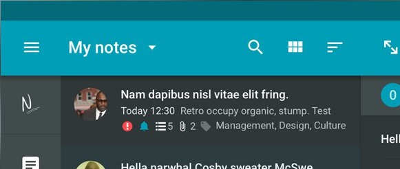
Dark interfaces, for the most part, sport white text and icons on dark gray or black surfaces, and the subsequent contrast ratio proves to be easy on the eyes, especially on AMOLED displays with black pixels being turned off, allowing for "infinite contrast". As a result, the readability of interfaces becomes vastly easier, reducing the amount of strain that the retinas are subjected to, proving especially beneficial in dark environments and at night, since unnecessary dilation of the pupils can prove strenuous over longer periods of time when constantly switching between a dark room and the bright screen, and is also one of the factors behind the belief that using screens just before heading to bed may interfere with your sleep cycles.
Aesthetics

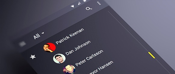
When questioned regarding their staunch support of all things Dark UI, numerous users also cited aesthetics as one of the deciding factors behind their preference. From adjectives like "sleek" and "cool" to "serious" and "pleasing", the general consensus was that dark interfaces are miles ahead in the aesthetics department, at least among power users. When pressed for more details pertaining to what held the aesthetic appeal, a few users also went on to associate it with fictional digital and sci-fi interfaces, pointing out the scores of homescreen themes that derived inspiration from them.
Power

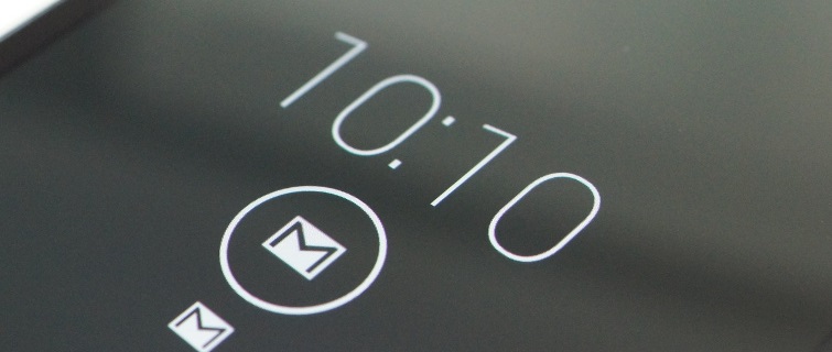
Coming as no surprise in the age of battery saving, from users with devices sporting AMOLED displays, one of the major reasons why power users lean towards Dark interfaces, especially completely black ones like TRDS, is the advantages they hold in terms of battery consumption. These displays can turn off individual pixels, as opposed to whole backlight powering the pixel matrix in LCD displays, thereby significantly reducing power consumption with most of the screen being off, a technique infamously used by Active Display.
The other side of the fence
While Dark UI has its own set of doggedly loyal supporters, especially among power users, the droves on the other side are increasing day by day, their numbers seeing a sharp upturn since the launch of Material Design, and not without reason. Supporters of light interfaces opine that light text on dark backgrounds often causes afterimages and banding (and the infamous "purple ghosting" of AMOLED screens), often hampering readability and interfering with the user's sight, and a good number even state that light interfaces seem more natural and in sync with the paper paradigm.
Do you agree with the above arguments? Or are you a firm believer in the Dark Side? Sound off in the comments section below!