Last week, we published images that depicted major UI changes in Google’s next Android OS release, Android 12. These images originated from a document that Google shared with its OEM partners and were likely mockups designed to showcase Android 12’s enhanced theming capabilities. In the few images that we obtained, we only caught glimpses of the notification panel UI, home screen, Privacy settings, and Google Camera app. While we assumed that any UI changes were a result of the new theming system, it seems there may be more UI changes in the works.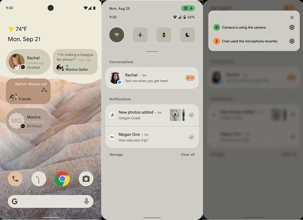
Early design mockups showcasing parts of Android 12's UI.
For starters, we have learned that Google has internally dubbed some of its notification UI changes as the start of the “road to Material NEXT.” Google’s Material Design guidelines have evolved significantly since their initial introduction. Most recently, the guidelines evolved to encourage companies to adopt their own identities on top of Material Design. For example, Google’s apps generally follow the company’s “Material Theme” design. While we do not know exactly what changes to the design Material “NEXT” will bring, they could be major considering what we saw in last week’s Android 12 leak. We doubt that Material “NEXT” will be the actual name of the new design guidelines; after all, Google never referred to its Material Theme changes as “Material Design 2.0” externally even though we know that is how they referred to it internally. We also do not know if the Material NEXT changes will encompass more than just notifications. However, we do know that Google has more UI changes in store for Android 12.
For example, Google is preparing to adjust the layout of the Always on Display and Lock Screen in Android 12. A few of the in-development changes include shifting the notification icons for the Always on Display so they are no longer centered in the new layout, shifting the clock view and smart space to be aligned to the top, moving the bottom logout button and owner information at the bottom of the lock screen rather than in the keyguard view, and adding the Pixel’s Now Playing text to the rotating text on the lock screen. There may also be new AOD/lock screen transitions, but we do not know what they will look like. However, these layout and transition changes will likely not be present in the Android 12 Developer Preview builds as Google is preparing to hide these changes using a “GX” (Google Experience?) overlay.
There are several other lock screen UI changes in-development for Android 12. Google is said to be finally tweaking the UI of the pattern lock used for the lock screen. They are also working to integrate Android’s Device Controls feature into a dialog on the lock screen, accessible from an “affordance” on the keyguard’s bottom area.
Left: Android's lock pattern UI. Right: Android's Device Controls UI.
Google may also finally enable additional lock screen clock options in Android 12, a feature that has been in development since Android 10. One of the most prominent changes to the in-development feature is the addition of a gradient color for the TypeClock face that is adjusted based on hardcoded times.

As we saw in the leaked images of Android 12 last week, major changes are in the works for the notification panel. The most prominent changes stem from the new wallpaper-based theming system, code-named “monet.” The specific theme shown off in the leaked images may be called “Silk”, and it could serve as Google’s representation for Android 12’s enhanced theming system. References to a “Silky Home” appear in multiple places internally, and it appears the theme is part of the “SilkFX” app. The new “Silk” style will also be compatible with Android for TVs (ie. Google TV/Android TV), though we don’t know what it’ll look like on TVs. We have learned that Google is also testing UI changes such as a thicker brightness slider in the notification panel; reduced horizontal margins, padding, and divider height; and possibly a two-column notification shade. We do not yet have images showing off any of these changes.
Google is also testing a change to the Quick Settings panel that might prove controversial. In Android 12, Google is preparing to shift the QS tile labels to the side. Prototyping for this feature began in late December, but it seems the feature became ready earlier this month. When enabled, QS tiles are displayed in only two columns. We aren’t exactly sure how this will look, but Android 11’s changes to the Quick Settings density was already controversial – any further reduction in the number of Quick Settings tiles shown on a single page will undoubtedly be even more so.

Android 11 introduced a media player in the notification shade, reducing how many QS tiles are shown in the expanded state.
Next, we are seeing mentions of a “letterbox” feature that Google is experimenting with. These “letterboxes” seem to be a new way to put apps into a frame/window, and they will have adjustable rounded corners and configurable background color. We are not entirely sure what this will be used for, though.
For third-party applications that don’t have their own splash screens, Android 12 may generate a default splash screen window that is either light or dark based on the current DayNight theme setting. This may be part of a broader effort to improve the app launch experience.
Lastly, in order to improve Android’s system-level theming capabilities, Android’s Runtime Resource Overlay (RRO) feature is getting a major upgrade. RROs have traditionally been APK packages that need to be installed on the device before they can be activated, but Android 12 can now generate non-APK RROs on-the-fly. It’ll be interesting to see how this is used, but we’re guessing that this will open up the ability to generate lots of custom themes that don’t need to be installed as system-level apps. Currently, most theme packages that use the RRO/OMS API are installed as static packages in read-only partitions. Generating RRO packages on-the-fly could be what makes Android 12’s new “monet” theming system a possibility.