Android 12 brought a whole new design to Android, and it wasn't necessarily a design that resonated with everyone. I was a fan of it, but the large buttons and pastel colors were a departure from what people knew the world's largest operating system to be. Android 13 solidifies that direction of design, as, at least so far, it's a very marginal iterative improvement.
If you're looking to try out Android 13 on your smartphone, then you can check out our guide on how to install Android 13 on your Google Pixel device. It's the very first development preview, meaning that not only is it likely buggy, but this is only the beginning of new features. Google expects the final release to come out later this year, which means there are going to be many months of changes between now and its final release.
Android 13 iterates on visual changes introduced in Android 12
Look and feel
If you've never used a Google Pixel smartphone, then you probably have no idea what Android 12 actually looks like in AOSP, much less Android 13. If you have used a Google Pixel smartphone, then Android 13 at a glance is completely indistinguishable from Android 12. Note that while Google Pixels do not run barebones AOSP, they look pretty similar.
The screenshots above look exactly like Android 12. Notifications are rounded, quick settings are expanded into the same number of tappable icons, and the settings app remains the same. The only real change that I've noticed is the introduction of a volume slider in the media player that can be moved over the current device being output.
Even the preloaded apps in the form of the Dialer, Google Messages, and the Files app all look the same.
Google says that Material You color theming (previously a Google Pixel exclusive) will also be coming to other OEM smartphones in the future.
Photo Picker API
The new Photo Picker API is an extension of Google's already-existing document picker. It works by leveraging the Android system to select documents on the device that are then selectively shared with the app in use, rather than the app having wider storage access to the files on the device itself.
The Photo Picker API reduces the overall access that an app has to your photo library
I invoked the photo picker API in the above screenshots with an app that had no storage access, but a photo can be selected by the Android system and selectively shared with an app. Currently, if you want to send a photo to a friend through an app directly, your entire photo library needs to be shared with that app. From there, the app lists all your photos, and you select one and choose it to send. Now, photos are listed by the Android system, and only the photo you choose is shared with the app. This reduces the overall access that an app has to your photo library.
New quick settings
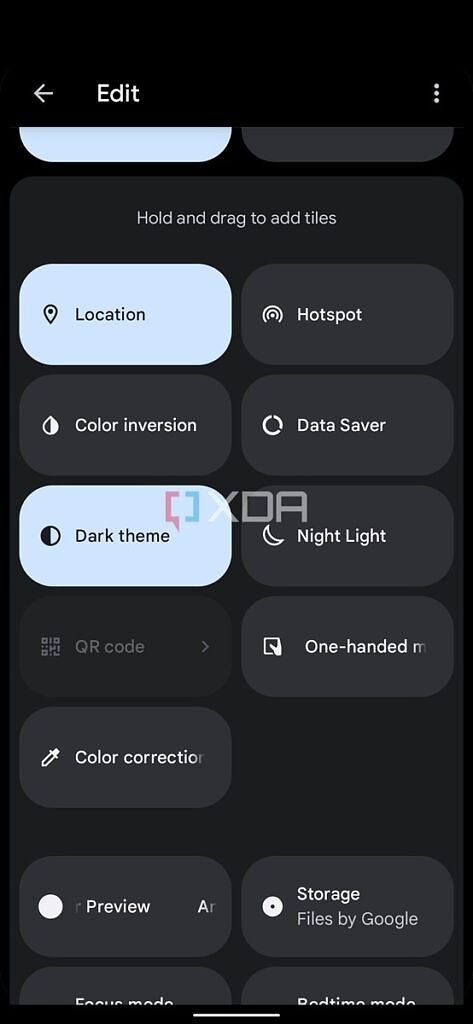
Google has also added a color correction quick setting, a one-handed mode quick setting, and a QR code quick setting. One-handed mode and the QR code scanner don't work yet, and the reason for the latter is that a compatible app hasn't been assigned to be the action of tapping it. Reports suggest that it's possible to set your own app for usage in this quick setting tile through adb, but I was unable to get that working.
Install to guest, more button options, better battery stats
Google has made a handful of changes in the settings too, including a new "install available apps" button to the guest user in the account switcher. There's also the ability to turn off holding down on the home button (when three-button navigation is on) to invoke the Google Assistant. Finally, Google has also added a proper X-axis guide to the battery statistics to make it clearer what's being looked at.
Android 13 is a familiar operating system with few visual changes... so far
Android 13 doesn't have a whole lot of user-facing changes, but there are enough to show what direction Google wants to take it. Android 12's design is, as expected, here to stay, and this is simply Google solidifying that design as the future of Android. I'm a big fan of these additions as all of them add functionality without taking away something that we previously had.
This is simply Google solidifying the Android 12 design as the future of Android
To be clear, all of these changes that we've documented here are visual changes. There are a ton of other improvements that are going to arrive in the future, such as easier user account switching, a Gboard-like clipboard auto-clear feature, and more. We'll be keeping an eye out for any more changes in the future, and be sure to let us know what you think about Android 13 in the comments!


