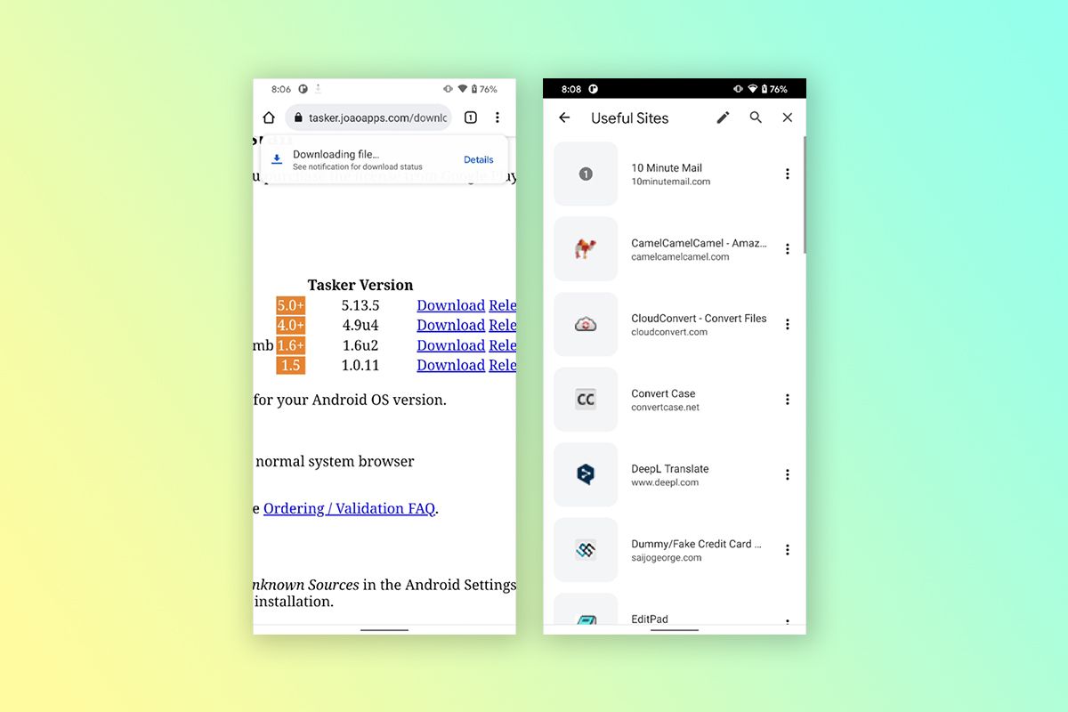
With the first Android 12 stable release right around the corner, Google has been hard at work updating its apps to conform with the new Material You design language. The company has already rolled out minor UI updates for several of its apps, including Chrome for Android, which received dynamic theming support earlier this month. The company is now testing a few additional design changes in the browser that give the downloads panel and bookmarks a more modern look.
As you can see in the attached screenshots, Google Chrome for Android's latest design refresh gives the browser's downloads panel a completely new look. Instead of a gray pop-up at the bottom, current downloads are displayed as a toast at the top of the screen in the new design. Completed downloads also appear in the same location in a rounded card with an "Open" button. The bookmarks pages have also received a design update, featuring larger squircle icons and more spacing between items.
The new downloads panel UI is currently enabled by default for many Chrome users running recent Canary builds of the browser. If you don't see it yet, you can manually enable it by flipping the "show download progress message" flag in chrome://flags. The bookmarks UI refresh, however, is not enabled by default in Canary builds, but you can get it by flipping on the "enables the visual refresh for bookmarks" flag.
Since the new design changes are limited to Chrome Canary releases at the moment, we can't be sure if Google will end up rolling them out in a stable release or not. We'll have to wait and see if Google decides to adopt this new design for the downloads panel and bookmarks.

