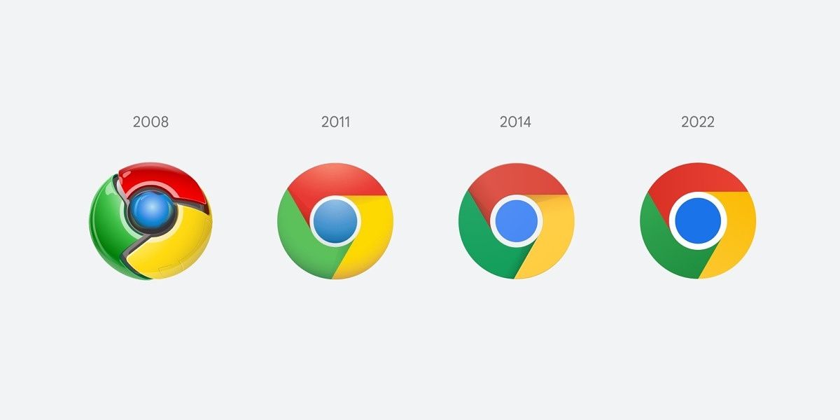
Google Chrome is one of the most important software projects in modern history, and its icon is instantly recognizable across desktop and mobile devices. The core concept of a blue circle surrounded by three pinwheel-like slices has remained the same since the first release in 2008, but it has evolved over the years, and now an updated icon is on the way.
Elvin Hu, an interaction designer at Google, shared the new icon design in a series of tweets. He said, "Some of you might have noticed a new icon in Chrome’s Canary update today. Yes! we’re refreshing Chrome’s brand icons for the first time in 8 years. The new icons will start to appear across your devices soon. [...] We simplified the main brand icon by removing the shadows, refining the proportions and brightening the colors, to align with Google's more modern brand expression."
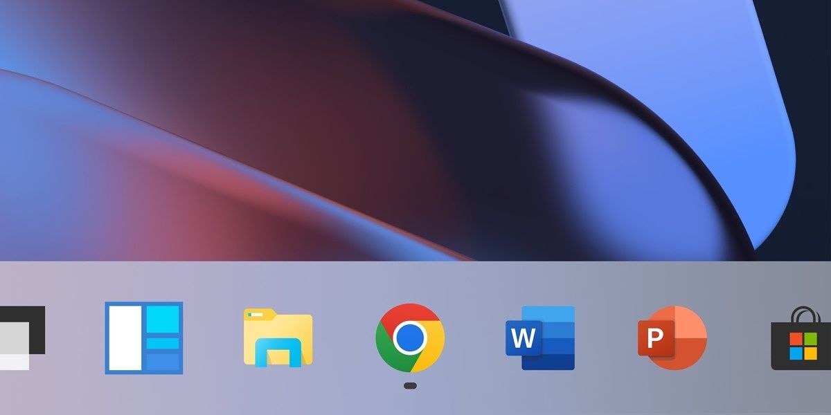
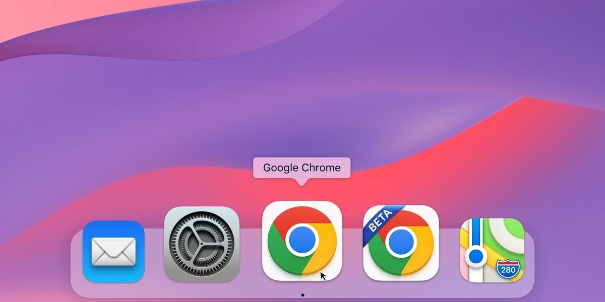
The new icon drops what was left of the shadows from the current icon design, but still maintains a slight gradient across the red, yellow, and green colors. The icon also won't look exactly the same on each platform. Windows will get a more gradated look to fit in with Microsoft's new Fluent UI, Chrome OS will get a version with completely solid colors to match the other system icons, and the Mac icon will have a shadow inside the existing white rounded square.
Google's design teams also considered an icon with white padding around each pinwheel slice, but idea was dropped because it would have shrunk the overall icon — and important factor on small screens. The updated icon will slowly roll out everywhere over the coming months.
New icons for popular applications are often contested, such as Slack's new logo and app icon from 2019, but this change is subtle enough that most people probably won't notice a difference.


