The launch of the Google Pixel 4 is only a few months away, and this year Google started up the hype train extraordinarily early by posting renders of the back of the smartphone four months in advance of its expected release. The front of the phone is still up for speculation, but what we do know is that Google is attempting to up the ante in their screen department. Google takes tremendous pride in their DisplayMate A+ rating of the Pixel 3 XL, even resorting to touting about it as a PR response to display issues (which I’ve also encountered as a canned customer service response). DisplayMate’s review clearly bolstered Google’s ego — here’s my take on the display.
The Future for Pixel Displays — A Preamble
Google is so close to making a smartphone with a display that could be considered among the best. Indoors, the Google Pixel 3 XL display is absolutely stellar with iPhone X(S)-like quality — colors, contrast, viewing angles and all. The silhouette on the front of the device is extremely sleek with a nice flat dark slab that hides the bathtub notch and chin well when the display is off (a result of the high-quality anti-reflection absorption layers), and a display that looks just as well-laminated as the iPhone X-series. Just like Apple, Google decided to use a flexible substrate on a flat screen — which I highly prefer — to achieve the plastered-screen look (hence “Flexible OLED” even though the screen appears flat). If Google implemented its panel’s high brightness mode I would give the Pixel 3 XL display an "A" rating, but Google has to go even further since the competition is boasting 600+ nits display brightnesses. Until Google does so, its displays will always seem lackluster since there are literally dozens of us that actually go outside, where the Pixel phone displays simply appear unpleasantly dim when compared to the competition.
On the opposite spectrum, Google also needs to improve the shadow calibration in their displays. Within some of our native habitats — in the pitch black — the Pixel phone displays have exhibited higher black clipping than most other handsets, making dark scenes a black blotchy mess. The Google Pixel 3 XL has done better than the rest of the Pixel devices in this regard, but it is evident that the issue lies with Google’s calibration. In every Pixel phone’s native wide gamut, there is noticeably less black crush, which suggests a low-breadth LUT or an error in the tone response curve/transformation matrix to sRGB.
To add to the low-brightness nuances, the brightness steps at the low end are jumpy and not smooth. At the minimum brightness, the Google Pixel 3 XL outputs 2.1 nits and jumps up to 3.5 nits at the very next step. This is a 67% increase from the previous step. For reference, it takes approximately a 5% increase or decrease in magnitude for a change in luminance to be noticeable (in subsequent patches), so 67% is a very noticeable jump. The next step outputs 5.0 nits (43% increase), then 6.4 nits (28% increase), then 8.0 nits (25% increase). This happens for most of the display’s lower brightness range, and it could be annoying for your display to sporadically stutter in brightness when using auto brightness. It also lowers the available range of brightness values to choose from in dim environments; at night time the jump from 2.1 nits to 3.5 nits is pretty large, and you might want a setting in-between.
Next up is color management. I previously wrote a similar segment in my Google Pixel 3 (non-XL) display review that I would like my readers to read since all of it is still relevant. With the Pixel 3 and Pixel 3 XL, Google moved on from defaulting to an accurate color profile and switching over to a new color saturation-expanding “Adaptive” profile. This profile does not have any form of color management, so using this profile doesn’t allow the viewing of photos in other color spaces at any proper fidelity. This is completely counterproductive to Google’s recent announcement that they are bringing wide color photos to Android. In the post, Google explains the importance of color management and color correctness in apps and how to prepare and implement the ideas, all of which would be pointless in the Adaptive profile.
Furthermore, I am fairly certain that the Google Pixel 4 will be the first to debut wide color photography in Android. I caught a hint of this last year during the Pixel 3 XL leaks when I noticed that the photo samples from the leaks had a Display P3 embedded color profile, coming from a dogfood-version of Google Camera. I was disappointed to see it omitted from the release product, but the recent Google wide color photo announcement leaves me no doubt that it is coming with the Google Pixel 4. They just won’t be properly viewable in the Adaptive profile, so I’m curious to see what Google is going to do. Google is also likely implementing an automatic white balance feature similar to Apple’s TrueTone, which suggests at least some focus on the display — be it just a feature — for the next Pixel.
Rant over.
Methodology ▼
Color Profiles
The Adaptive profile is the punchier, color saturation-expanding profile and is set on the Google Pixel 3 XL by default. It does not support any form of automatic color management, and from my usage, there is nothing “adaptive” about this color profile.
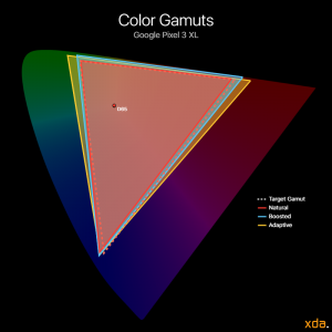
The Natural profile is the color-accurate profile that targets the industry standard sRGB color space by default. The profile also supports Android 8.0 Oreo’s automatic color management system, so apps that properly support rendering content with embedded color profiles (which are currently few and far between) can display content in their respective color space.
The Boosted profile is the Natural profile with, unsurprisingly, a slight boost in saturation. According to Google, the profile boosts the saturation in all directions by 10%. You can change the amount boosted with adb and root.
Brightness
Bottom of the barrel; poor sunlight visibility — D
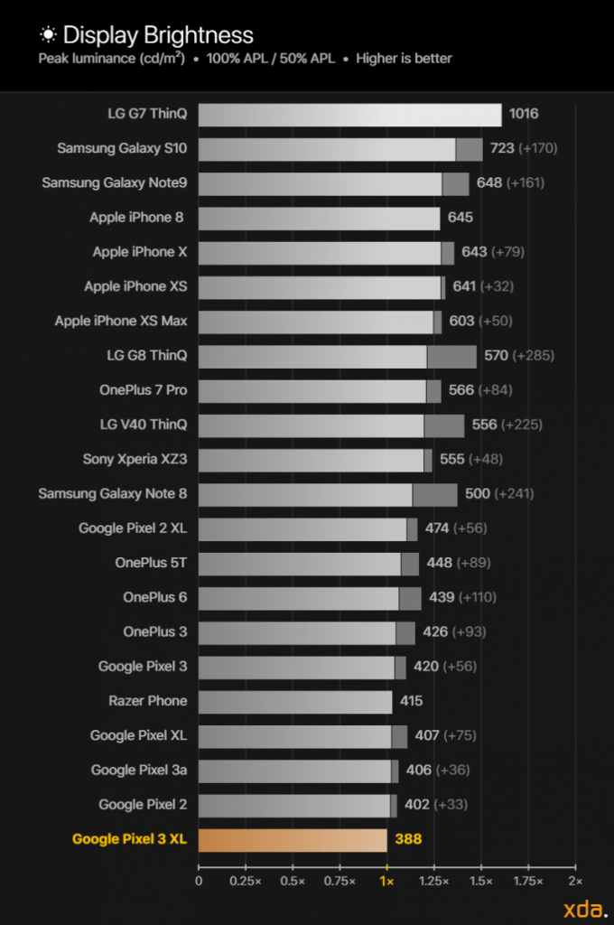
Our display brightness comparison charts compare the maximum display brightness of the Google Pixel 3 XL relative to other displays that we have measured. The labels on the horizontal axis on the bottom of the chart represent the multipliers for the difference in perceived brightness relative to the Google Pixel 3 XL display, which is fixed at “1×”. The magnitude of the displays’ brightnesses, measured in candelas per square meter, or nits, are logarithmically scaled according to Steven's Power Law using the modality exponent for the perceived brightness of a point source, scaled proportionally to the brightness of the Google Pixel 3 XL display. This is done because the human eye has a logarithmic response to perceived brightness. Other charts that present brightness values on a linear scale do not properly represent the difference in perceived brightness of the displays.
When measuring the display performance of an OLED panel, it is important to understand how its technology differs from traditional LCD panels. LCDs require a backlight to pass light through color filters that block wavelengths of light to produce the colors that we see. An OLED panel is capable of having each of its individual subpixels emit their own light. This means that the OLED panel must share a certain amount of power to every lit pixel from its maximum allotment. Thus, the more subpixels that need to be lit up, the more that the panel’s power needs to be divided over the lit subpixels and the less power that each subpixel receives.
The APL (average pixel level) of an image is the average proportion of each pixels’ individual RGB components across the entire image. As an example, a completely red, green, or blue image has an APL of 33%, since each image consists of completely lighting up only one of the three subpixels. The complete color mixtures cyan (green and blue), magenta (red and blue), or yellow (red and green) have an APL of 67%, and a full-white image that completely lights up all three subpixels has an APL of 100%. Furthermore, an image that is half black and half white has an APL of 50%. Finally, for OLED panels, the higher the total on-screen content APL, the lower the relative brightness of each of the lit pixels. LCD panels do not exhibit this characteristic (barring local dimming), and because of it, they tend to be much brighter at higher APLs than OLED panels.
In typical Google fashion, the display on the Pixel 3 XL is among the dimmest out of any flagship smartphone available, even being outshined by many mid-range devices. The main reason for this is that Google does not utilize the High Brightness Modes in their displays, which all of Google’s Pixel phones are capable of. It requires root to toggle, but it is long overdue for Google to implement it seamlessly into the auto brightness system. With High Brightness Mode, the Google Pixel 3 XL can reach 525 nits at 100% APL, which perceptually appears about 16% brighter than without High Brightness Mode. While 525 nits is still not very competitive with other flagship displays, it still slightly aids in viewing the Google Pixel 3 XL under brighter conditions.
To activate High Brightness Mode on your Pixel device, you must first be rooted, then enter the following adb command: adb shell echo "on" >> /sys/class/backlight/panel0-backlight/hbm_mode
Most OLEDs typically save power by lowering the brightness of the display as total display emission increases. The display in the Google Pixel 3 XL almost completely disables this mechanism, varying its brightness little-to-none with content APL, which is necessary for accurate tone response.
At the low end, the Google Pixel 3 XL gets as low as 2.1 nits, which is just fine, but even lower would help some people use the phone more comfortably during night time. Displays such as the Apple iPhone XS and the Samsung Galaxy S10 can go down to 1.7 nits, which is noticeably dimmer.
The brightness steps in the Google Pixel 3 XL are still messed up like they were in all the previous Pixels. I originally wrote about it in my Google Pixel 3 (non-XL) display review, and a whole beta OS update and device release later, Google still hasn’t fixed the distribution of their brightness steps. Simplified, Google doesn’t have enough brightness steps in the lower range of the brightness slider to allow smooth transitions when changing brightness levels, and the exponent that Google uses (2.5) to map the brightness setting to the output luminance is too high, resulting in a ramp up that is too slow in the dim end and too intense near the peak. No other handsets I have tested lately have either of these issues.
Color Accuracy
Excellent; includes wide gamut support — A+
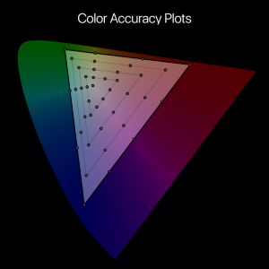
Our color accuracy plots provide readers with a rough assessment of the color performance and calibration trends of a display. Shown below is the base for the color accuracy targets, plotted on the CIE 1976 chromaticity scale, with the circles representing the target colors.
In the color accuracy plots below, the white dots represent the position of the Google Pixel 3 XL's measured colors. The associated trailing color represents the severity of the color error. Green trails signify that the measured color difference is very small and that the color appears accurate on the display, while yellow trails indicate noticeable color differences, with higher severity at orange and red trails.
In its Natural profile, the Google Pixel 3 XL is among the most chroma-accurate smartphones, sharing the top with the other Pixel phones and the iPhones. All Google Pixel devices support Android’s automatic color management, so they can also display content in other wider color spaces if the app supports it. Testing it out, Google Pixel 3 XL excels not only in reproducing the sRGB color space, but it is just as accurate when rendering P3 content: both gamuts are targeted with an average ΔE of 0.9 with very low variance. The maximum error for both gamuts is when rendering 100% blue at low brightness, reporting a ΔE of 2.7 and 3.0 for the sRGB and P3 gamuts, respectively. Both maximum errors are just unnoticeable, meaning that the Google Pixel 3 XL has a display in which all colors appear accurate at all brightness levels (except for when very low, <10 nits).
Contrast & Tone Response
Slightly skimped shadow rendering with otherwise-excellent tone response — A
The gamma of a display determines the overall image contrast and lightness of the colors on a screen. The industry standard gamma that is to be used on most displays follows a power function of 2.20. Higher display gamma powers will result in higher image contrast and darker color mixtures, which the film industry is progressing towards, but smartphones are viewed in many different lighting conditions where higher gamma powers are not appropriate. Our gamma plot below is a log-log representation of a color’s lightness as seen on the Google Pixel 3 XL display versus its associated input signal level. Measured points that are higher than the 2.20 line mean the color tone appears brighter than standard, while lower than the 2.20 line means the color tone appears darker than standard. The axes are scaled logarithmically since the human eye has a logarithmic response to perceived brightness.
Most modern flagship smartphone displays now come with calibrated color profiles that are chromatically accurate. However, due to the OLED property of lowering the average lightness of the colors on the screen with increasing content APL, the main difference in the total color accuracy of modern flagship OLED displays is now in the resulting gamma of the display. The gamma makes up the achromatic (grayscale component) image, or the structure of the image, which humans are more sensitive in perceiving. Therefore, it is very important that the resulting gamma of a display matches that of the content’s, which typically follows the industry standard 2.20 power function.
Chroma accuracy is just one half of the equation. The other, arguably more important component to color, is its luminance, and the Google Pixel 3 XL nails this, too. The Pixel 3 XL display gamma ranges from 2.20 to 2.31 and averages out to about 2.25, which is excellent and appears completely accurate for almost all color mixtures besides those with signal levels below 10%. It is at these low signal levels where the Pixel 3 XL display struggles to render colors in its Natural profile, crushing blacks at and below 3% signal level (channel values below 9 in 8-bit). In its Adaptive profile, however, the Google Pixel 3 XL’s shadow rendering is superior, lowering its black clipping threshold from 3% signal level to 1.6%, gaining 5 full channel 8-bit channel values.
Drive Balance
Mostly consistent appearance — B
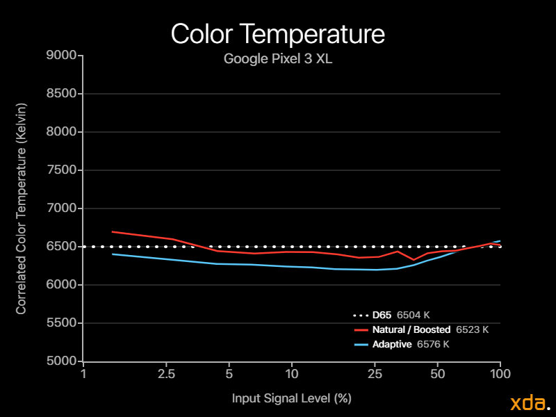
The color temperature of a white light source describes how “warm” or “cold” the light appears. Color typically needs at least two points to be described, while the correlated color temperature is a one-dimensional descriptor that leaves out essential chromaticity information for simplicity.
The sRGB color space targets a white point with a D65 (6504 K) color temperature. Targeting a white point with D65 color temperature is essential in color accuracy since the white point affects the appearance of every color mixture. Note that, however, a white point with a correlated color temperature that is close to 6504 K may not necessarily appear accurate! There are many color mixtures that can have the same correlated color temperature (called iso-CCT lines) — some that don't even appear white. Because of this, the color temperature should not be used as a metric for white point color accuracy. Instead, we use it as a tool to represent the rough appearance of the white point of a display and how it shifts over its brightness and grayscale. Regardless of the target color temperature of a display, ideally its correlated color temperature of white should remain consistent at all signal levels, which would appear as a straight line in our chart below.
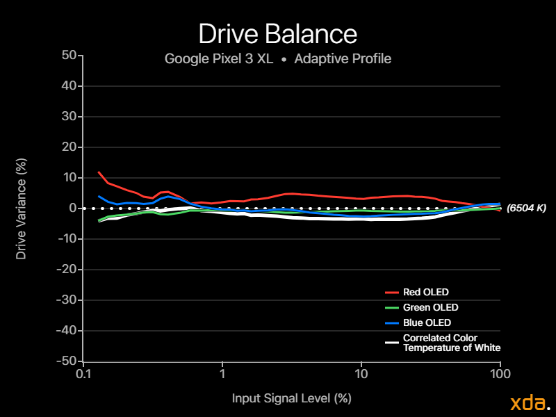
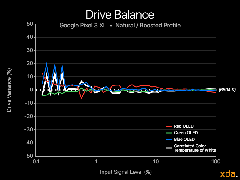
The drive balance charts show how the intensities of the individual red, green, and blue LEDs vary with display brightness, overlain with the display's correlated color temperature of white, and they reveal the "tightness" of the color calibration of the display. The charts show much more color information than the one-dimensional color temperature chart. Ideally, the red, green, and blue LEDs should remain as consistent as possible throughout the display's brightness range.
The drive balance of the Natural profile is good. The three OLEDs are tightly coupled with no noticeable variance from 10% to 100% signal level, with a slight red bias in the shadows, then steering cold at even lower signal levels. The Adaptive profile seems to have a smoother LUT, but slightly higher variance in its red OLED, tinting the display slightly warmer for midtones and shadows.
Google Pixel 3 XL Display Overview
Good
|
Bad
|
|
XDA DISPLAY GRADE B+ |
| Specification | Google Pixel 3 XL | Notes |
|---|---|---|
| Type | Flexible OLED PenTile Diamond Pixel | |
| Manufacturer | Samsung Display Co. | |
| Size | 5.8 inches by 2.7 inches 6.4-inch diagonal 15.2 square inches | |
| Resolution | 2960×1440 pixels 18.5:9 pixel aspect ratio | Actual number of pixels is slightly less due to rounded corners and cutout |
| Pixel Density | 370 red subpixels per inch 523 green subpixels per inch 370 blue subpixels per inch | PenTile Diamond Pixel displays have fewer red and blue subpixels compared to green subpixels |
| Distance for Pixel Acuity | <9.3 inches for full-color image <6.6 inches for achromatic image | Distances for just-resolvable pixels with 20/20 vision. Typical smartphone viewing distance is about 12 inches |
| Brightness | 388 nits @ 100% APL
393 nits @ 50% APL
398 nits @ 1% APL
Poor
(HBM) 525 nits @ 100% APL
3% variance with APL |
Dynamic brightness is the change in screen luminance in response to displayed content APL |
| Angular Shift | -26% for brightness shift ΔE = 6.8 for color shift | Measured at a 30-degree incline |
| Black Clipping Threshold | <3.1% for Natural/Boosted <1.6% for Adaptive | Signal levels to be clipped black. Measured at 10 cd/m² |
| Specification | Natural | Adaptive | Notes |
|---|---|---|---|
| Gamma | 2.20–2.31 Average 2.25 Excellent | 2.21–2.30 Average 2.26 Accurate to standard | Standard is a straight gamma of 2.20 |
| White Point | 6523 K ΔE = 1.5 Excellent | 6576 K ΔE = 1.1 Accurate to standard | Standard is 6504 K |
| Color Difference | Average ΔE = 0.9 ± 0.5
Maximum ΔE = 2.7
at 100% blue
for sRGB
Average ΔE = 0.9 ± 0.5 Maximum ΔE = 3.0 at 100% blue for P3 Exceptionally accurate Maximum errors appear accurate |
Average ΔC = 7.3 ΔC = 10.6 for red / ΔH = 0.1 towards magenta ΔC = 12.9 for green / ΔH = 4.9 towards cyan ΔC = 4.0 for blue / ΔH = 1.3 towards cyan | ΔE values below 2.3 appear accurate ΔE values below 1.0 appear indistinguishable from perfect ΔC measures difference just in saturation relative to sRGB colors ΔH measures difference in hue relative to sRGB colors |

