Google unveiled the latest iteration of its Material design language -- Material You -- at I/O earlier this year. Since then, the company has been preparing to update its apps to follow the new design language, adding new elements bit by bit. Over the last few months, we've spotted quite a few of these changes in Google Chrome, Google Messages, Google Contacts, and more. The company is now rolling out a Material You redesign for the time picker UI in its Android apps.
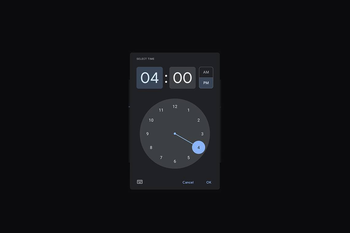
As per a recent report from 9to5Google, the new time picker UI features a more touch-friendly design. As you can see in the attached screenshots, the updated UI offers better spacing for hours and minutes fields, making them easier to tap. The AM/PM buttons also have more distinct borders around them.
Screenshots: 9to5Google
When you pop open the keyboard to enter the time manually, the new UI makes better use of the available space. Instead of a large "Set time" header, the time fields now take up most of the space. The AM/PM dropdown has also been replaced with more distinct buttons. The highlight on the AM/PM buttons is also more discernable than before. The following image shows the landscape version of the new UI.

The updated time picker UI is rolling out to several Google apps over the last few weeks. It's available in Google Search when setting Assistant Reminders, and it's also available on Google Keep version 5.21.301.10. However, it's yet to roll out to Google Calendar, Tasks, and Clock.
As mentioned earlier, Google has been rolling out several such Material You design changes to its apps over the last few months. You can read more about them by following this link.