The Google Assistant is one of the biggest breakthrough developments by Google in recent years. What was once introduced with the original Google Pixel smartphones as your friendly device assistant has now greatly evolved with features and general improvements, and it's shaping up to become a key part of Google's ecosystem. Nowadays, you can find the Google Assistant in several devices: phones, speakers, headphones, TVs, cars, and much more. But they're still a central part of our phones, even more so today than ever. Now, this is becoming even truer as Google seems to be testing another facelift for the Google Assistant's UI.
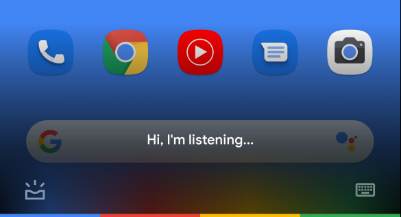
Currently, if you hold on to your home button, you will get a white card with the Google Assistant's dialog and suggestions as well as some shortcuts. This white card is being removed entirely together with the suggestions: a black gradient takes its place, in tandem with Google's newfound love for dark themes. Additionally, the shortcuts for things like the keyboard and At a Glance also remain. We also get a Google-themed colored bar at the bottom, which looks just like the light bar we used to see on devices such as the Pixel C and, in my opinion, seriously adds up to its looks.
The redesigned Google Assistant interface (left) versus the current interface (right).
So far, though, this seems to be an A/B test. So far, very few people have reportedly gotten this new design. I independently tried updating to the latest version of the Google app without luck. However, your mileage may vary.
Overall, I really dig this new look. It looks a lot cleaner and minimalistic and overall better looking than what we have right now, even if it comes at a cost of a slight loss of functionality. As it's an A/B test, though, we don't really have a lot to celebrate until it rolls out to the wider public.
Do you like it? Let us know your thoughts in the comments below.