While the Play Store has a ton of great browser apps to choose from, Google's own Chrome app reigns supreme for several different reasons. One of these is the fact that Google keeps bringing new useful features to the app with each successive update. The company has already released several useful features like VR support, Adaptive Icons for installed PWAs, and more to the app in the recent past. Most recently, we discovered the Google was planning on adding a Games Hub to Chrome on Android. And now, the latest update for Chrome Canary suggests that Google is testing a new UI design for the new tab page.
The redesigned UI for the new tab page was spotted on Chrome Canary v81.0.3991.0 and it looks a fair bit cleaner than the current new tab UI. As you can see in the screenshots below a majority of the UI elements have been moved closer to the top of the display. The Google logo is smaller in size and rests in the center at the top with the search bar right underneath.
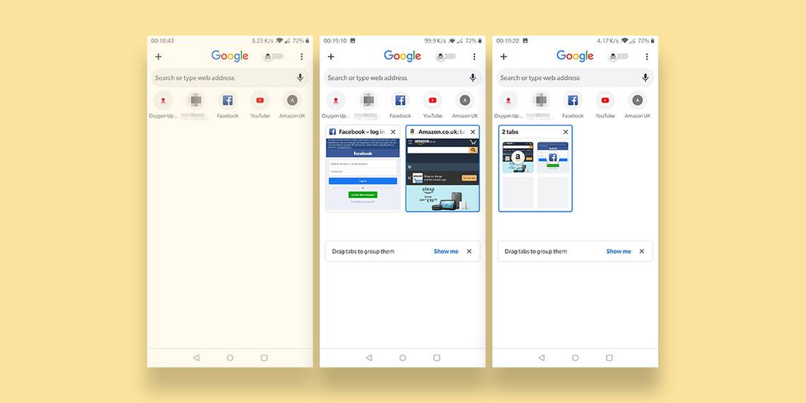
Links to your favorite and recently visited web pages have also moved up along with the search bar, leaving a whole lot of empty space towards the bottom. Instead of showing suggested articles, the empty space towards the bottom is now utilized for tab organization and allows users to group tabs together for easier access.
Switching to incognito mode is also a whole lot simpler with the new UI as the feature now has a dedicated toggle right at the top next to the Google logo. The new UI is being tested with a handful of users and if you're one of the lucky few you wouldn't need to enable any experimental flags to turn it on. However, we can confirm that you can force enable the new UI in Chrome Canary v81.0.3991.0 by turning on the enable-duet-tabstrip-integration flag in chrome://flags.
Thanks to XDA Senior Member Some_Random_Username for the screenshots!