In recent months, the Pixel 2 XL has been the subject of many controversies, with conflict brewing over the phone's display even before its release. After the dust had settled, it became something of a refrain: The Pixel 2 XL's screen is plagued with issues, including premature burn-in, angular color shift, “muted” colors, “black crush”, and “black smear”. While some of these issues can be chalked up to poor display production, some aspects require a more thorough look. We will attempt to cover the Pixel 2 XL's display performance in as much depth as we can.
The Pixel 2 XL is the big stepbrother in Google’s 2017 flagship phone lineup, bearing a 5.99-inch POLED display manufactured by LG. The screen looks very sharp thanks to its resolution of 2880×1440, the pixels of which are situated in a PenTile Diamond Pixel arrangement.
The PenTile Diamond Pixel array provides intrinsic subpixel anti-aliasing and increases panel longevity by using fewer blue subpixels, which deteriorate much more quickly than red and green subpixels. Consequently, the PenTile subpixel arrangement has one-third fewer total subpixels than the conventional RGB stripe subpixel pattern found on most LCDs, but the PenTile subpixel arrangement exploits the human visual cortex’s sensitivity to green and to luminance (compared to chrominance). The screen maintains a 1:1 green subpixel-to-pixel ratio, giving the PenTile display the same luma resolution as a conventional RGB stripe display while introducing potential color fringing, but at the Pixel 2 XL’s pixel density, no fringing is visible and the screen appears perfectly sharp in most scenarios. The notable exception is VR, but the Diamond Pixel shape does help to mitigate the dreaded screen-door effect.
It is not Google’s first time using this display technology in its phones; the Google Pixel, Google Pixel XL, Nexus 6P, Nexus 6, and Galaxy Nexus all have OLED panels with a PenTile subpixel arrangement. Furthermore, all of the phones’ OLED displays are capable of outputting color that is outside of the sRGB color gamut. Almost all content color is deliberately described with respect to the sRGB color gamut, so it is important for a display to be able render those colors correctly. The problem is that these phones originally did not color-manage content in their native display modes, resulting in colors with much more chrominance than the original content creator intended. Google took initiative in tackling this problem with the release of Pixel 2 and Pixel 2 XL, along with Android Oreo, which introduces color management for devices that support wide color.
With the Pixel 2 and Pixel 2 XL, Google says that “[o]ne of [their] design intents was to achieve a more natural and accurate rendition of colors”. We will assess the Pixel 2 XL’s display performance, and conclude if Google's efforts in color accuracy deserve merit.
Color Difference Metrics
We will be using the color difference measurement CIEDE2000 (shortened to ΔE), compensated for luminance, as a metric for chromatic accuracy. Other color difference metrics exist as well, such as the color difference Δu'v' on the CIE 1976 u'v' chromaticity diagram, but these metrics are inferior in perceptual uniformity, as the threshold for a just-noticeable-difference (JND) between color can wildly vary. For example, a color difference of 0.008 Δu'v' is not visually noticeable for blue, but the same measured color difference for yellow is very noticeable. CIEDE2000 is the industry-standard color difference metric proposed by the International Commission on Illumination (CIE) that best describes the perceptually uniform differences between color. This metric normally considers luminance in its computation since luminance is a necessary component to completely describe color, which is helpful when calibrating a display to a certain brightness. However, smartphone displays constantly change brightness, and the overall error can be volatile when measuring a display at different brightness levels. For this reason, luminance error will be compensated for in our ΔE values so only chromaticity is being measured. Display color measurements will be taken with a display brightness of 200 cd/m² to ensure consistency, and presented luminance errors will be in accordance with the standard sRGB gamma power function of 2.2 for reference.
In general, when the color difference ΔE is below 3.0, the difference in color is only noticeable in diagnostic conditions, such as when the measured color and target color appear right next to each other on the display being measured. Otherwise, the color difference is not visually noticeable and appears accurate. A color difference ΔE of 1.0 or less is said to be completely indistinguishable from perfect, and appears identical to the target color even when adjacent to it.
Brightness
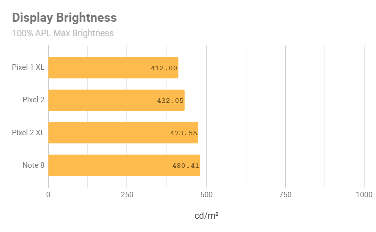
Our Pixel 2 XL unit reaches a maximum brightness of 474 cd/m² at 100% APL, or average picture level (the average active luminance percentage of each subpixel relative to the set display brightness), which is a respectable increase from the Pixel XL's 412 cd/m² and the Pixel 2's 432 cd/m². Note that this measurement was taken after the Android 8.0 update in November 2017, which Google says decreases the maximum brightness of the Pixel 2 XL by 50 nits (cd/m²). This decrease is only noticeable at lower APLs, at which the Pixel 2 XL should be plenty bright. In any case, the Pixel 2 XL's display brightness at 100% APL is competitive with the Note 8’s measured brightness of 480 cd/m² at 100% APL on automatic brightness with the phone's brightness overdrive active.
The average APL for digital media consumption hovers around 40%, so brightness measurements around that APL range are much more practical. At 50% APL, our Pixel 2 XL measures 530 cd/m², which is adequately bright for outdoor use, but trumped by the likes of the Note 8, which we measured 643 cd/m² at 50% APL. Unlike the Note 8, the Pixel 2 XL does not offer a brightness overdrive feature, and maintains the same maximum brightness with Adaptive Brightness on or off.
The display drops down to 4.1 cd/m² on the lowest brightness with Adaptive Brightness off. With Adaptive Brightness enabled, the display drops to 1.6 cd/m² -- about as low as most other smartphone displays.
Grayscale Accuracy and Intensity
An accurate grayscale and white point are fundamental to producing accurate color. A shift in grayscale will propagate error throughout a display’s entire color gamut (with the exception of the 100% primaries—red, blue, and green), so it is absolutely crucial to analyze a display’s grayscale to evaluate primary sources of error when measuring for color accuracy. Google states that they calibrated the Pixel 2 XL's display to a D67 white point, which is not a great start to any pursuit of accurate color.
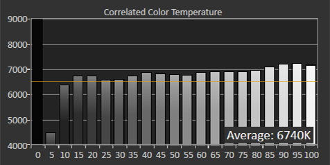
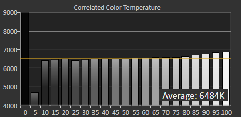
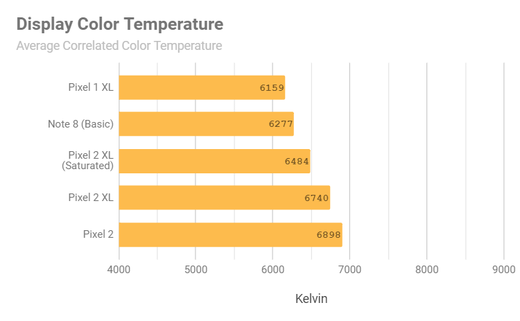
The average correlated color temperature is indeed at about Google’s claimed 6700K. The white point at the higher intensities become even colder, peaking at 7239K at 95% white, which is in the range of most content backgrounds. From this breakdown, we can see that the display is blue-shifted at nearly all intensities, which will affect color mixtures—especially the secondary colors. Note that the grayscale for the Natural and Boosted color profiles are exactly the same.
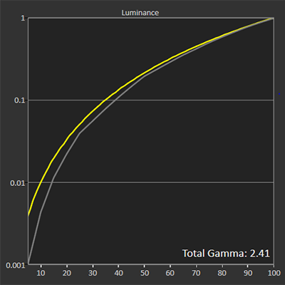
The Pixel 2 XL’s display gamma is somewhat concerning. The standard target gamma for sRGB/Rec.709 is a consistent power curve of 2.2. However, the Pixel 2 XL’s display gamma seems to be following a power curve of 2.4, which was popular in HDTVs before the BT.1886 recommendation. As a result, color mixtures may appear darker on the phone’s display, and the luminance range among the blacks will increase. This is helpful because the human eye is much more sensitive to changes in darker colors than changes in brighter colors, though it is only really noticeable if the viewer is in a dark environment.
A power curve of 2.4 is not wrong to target—many HDTVs still target this power curve—but Google failed to see the consequences of applying this darkening power curve to a smartphone. The higher gamma power is meant for cinemas and large TVs in dark environments. Smartphones are smaller devices that are used in a variety of lighting conditions, so the resulting lower-intensity colors are not ideal in all environments, like outside during a sunny day. Those would be better served by a lower gamma power function, like 2.0, to deliver better visibility with respect to low-intensity colors.
Additionally, the Pixel 2 XL's higher power curve further clips the blacks near 0% intensity. “Crushed blacks” are an inherent hardware limitation of current-generation OLED displays, as they have an absolute minimum non-black level that usually isn't dim enough to provide full 8-bit depth intensity except at very high brightness levels. For the display calibrators insistent on using a display gamma of 2.4, the BT.1886 recommendation partially remedies the black clipping issue by suggesting an initial lower power curve for lower intensities that ramps up to the power curve of 2.4. The lower gamma near the black level will help brighten up those few initial luminance steps, and this gamma specification is much more suitable for OEMs that wish to apply that cinematic feel to their smartphone displays while minimizing crushed blacks.
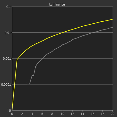
In the Pixel 2 XL’s case, it seems that Google is using an abnormally high initial gamma power function—even higher than 2.4—for the lower luminance ranges. This will clip blacks even further than normal for OLED displays and will negatively impact viewings of darker films and videos. During a full-step measurement for the lower 20% luminance range, our Pixel 2 XL’s intensity scale looks jagged and clips intermediary steps, as seen by the straight horizontal lines and sudden, steep changes for the first 6% of the luminance range. Anything below 3% will be crushed.
Note that when viewing casual media consumption, lighter shades can be crushed black, as the threshold for clipping to black increases with content APL. Furthermore, the exaggerated black crushing and jagged intensity scale appears to be the result of Google improperly transferring the Pixel 2 XL’s intensity scale when calibrating the display to sRGB.
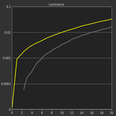
When the Pixel 2 XL is set to its native display gamut, the intensity scale becomes much smoother, and the threshold for clipping to black decreases from 3% to 2.4%, putting the Pixel 2 XL in line with the Note 8 with regards to black clipping. Both the Pixel 2 XL and Note 8 would benefit greatly from a higher initial gamma to brighten up the blacks and to minimize black clipping.
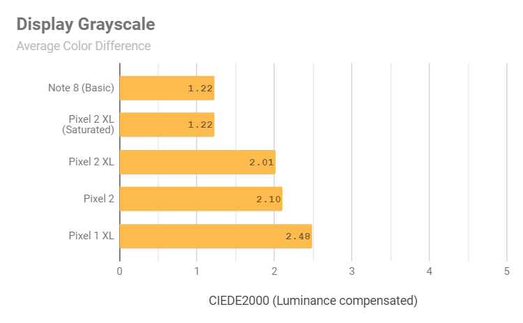
What’s surprising is that the Pixel 2 XL has one of the most accurate grayscales on any smartphone display in its native display gamut, surpassing even our Note 8 unit.
Despite the higher gamma and the intentional white point variation, the Pixel 2 XL’s grayscale is still accurate to the sRGB/Rec.709 specification. The grayscale on the Natural and Boosted color profiles yield an average color temperature of 6740K and an average grayscale color difference ΔE = 2.01. On the Saturated color profile, which is the Pixel 2 XL’s native display gamut, the Pixel 2 XL has an astounding, perceptually near-perfect average grayscale color difference ΔE = 1.22. From these measurements, it seems possible that Google could provide an sRGB color profile with native gamut grayscale accuracy, or better yet, a color temperature slider like Samsung and others have been doing. This is an overall improvement to the Pixel XL’s sRGB grayscale accuracy, though the Pixel XL does have a more-welcome gamma power function of 2.2. The Pixel 2 XL’s grayscale on the Natural and Boosted color profiles is not as accurate as the Note 8’s grayscale on the Basic screen mode, but the Pixel 2 XL’s grayscale accuracy is just fine, and, without diagnostic reference, visually accurate.
Saturation and Color Accuracy
Out of the box, the Pixel 2 XL defaults to Google’s Boosted color profile, which targets the sRGB color gamut expanded by 10% in all directions to slightly increased color vibrancy. Google claims to have defaulted to this profile since “[h]umans perceive colors as less vibrant on smaller screens, such as on a smartphone”. While this may seem like a good idea, Google did not account for the human eye’s non-uniform sensitivity to light: While reds appear slightly boosted, greens and yellows receive a more significant boost that turns their high-intensity mixtures to a sickly neon, and blues look like they receive almost no boost at all.
Before analyzing the Pixel 2 XL's default profile, we will first take a look at the phone's Natural color profile, which targets the sRGB color gamut with a D67 white point.
Natural Color Profile
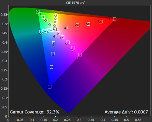
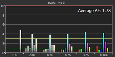
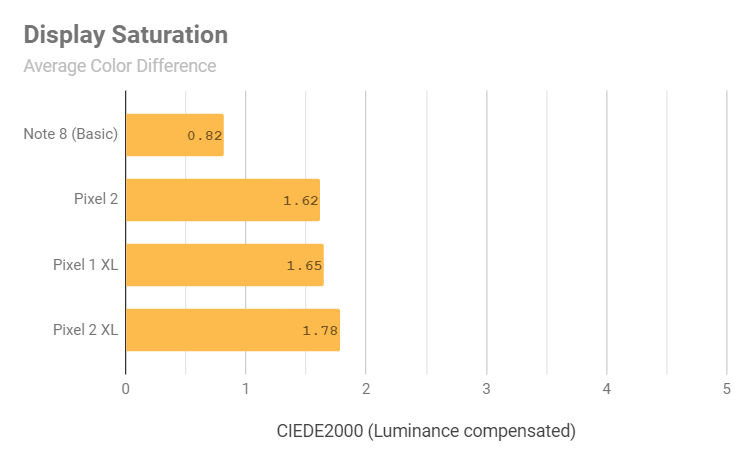
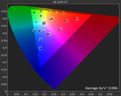
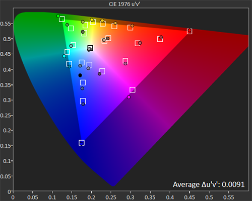
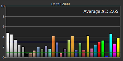
On the CIE 1976 u'v' chromaticity diagram, the Pixel 2 XL covers about 92.3% of the sRGB color gamut, falling short most noticeably at near-100% intensity red. However, it's important to note that the CIE 1976 u'v' chromaticity diagram is not perceptually uniform, and that the perceptual color difference in red is much less severe than the diagram suggests; the chromatic difference of 100% red is actually only a ΔE of 1.34, which is visually undetectable. The blue-shifting in the grayscale becomes apparent in the secondary colors, shifting both magenta and cyan towards blue, and skewing yellow ever-so-slightly toward green. Despite the secondary color hue shifts, the Pixel 2 XL properly saturates most of its colors, with an average saturation color difference ΔE = 1.78 and a maximum saturation color difference ΔE = 4.22 at 100% cyan.
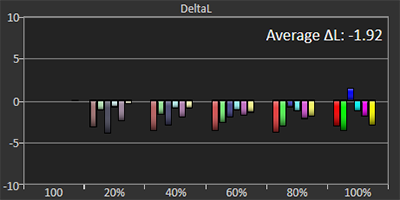
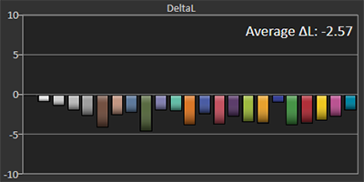
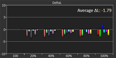
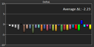
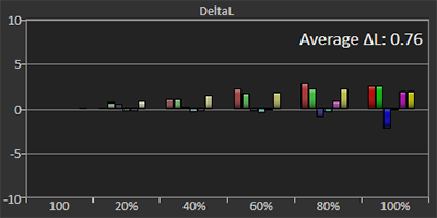
Do not mistake saturation for luminance; the Pixel 2 XL’s display hits all its saturation targets with the exception of cyan, which it oversaturates, but its cinematic display gamma produces colors that may seem dimmer than usual, as the gamma is more suited to low-light viewing. However, as a result of the Pixel 2 XL’s overall blue shift at nearly all luminance levels, the red gamma is consistently higher, meaning reds will necessarily be slightly dimmer relative to other color mixtures, as seen in the above luminance difference chart.
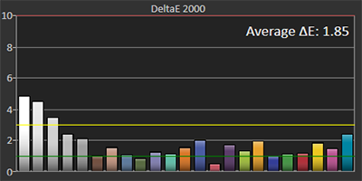
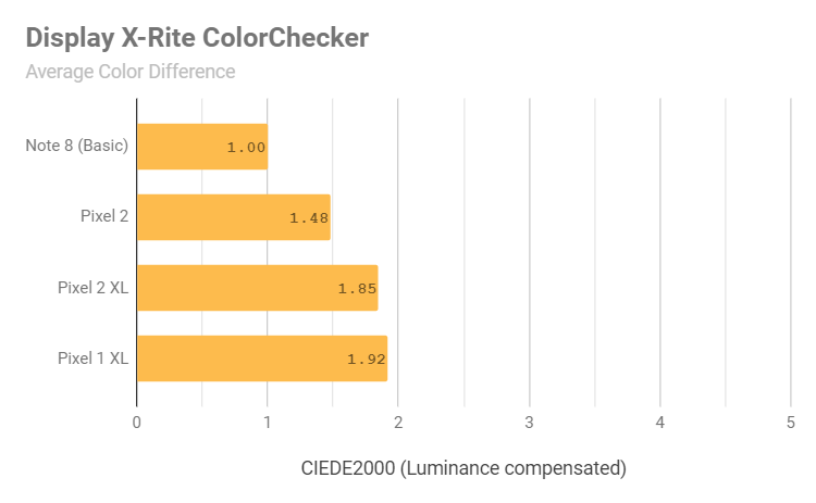
The X-Rite ColorChecker, formerly the GretagMacbeth ColorChecker, is a set of colors to test for color accuracy on displays. It differs from the saturation sweep by using color mixtures that often appear in photographs and nature, such as skin colors and foliage, and that are known to be difficult to accurately reproduce digitally. A look at a display’s X-Rite ColorChecker color accuracy is helpful in speculating a display’s color performance in photographs and films, while a saturation sweep is better suited to more solid, vibrant content, such as app icons, logos, colorful wallpapers, animations, and app interface elements such as Android's action bar. The Pixel 2 XL fares very well in the ColorChecker, with an average X-Rite ColorChecker color difference ΔE = 1.85 and a maximum non-grayscale X-Rite ColorChecker color difference ΔE = 2.41 at the cyan color coordinate (0.1473, 0.4120).
Boosted Color Profile
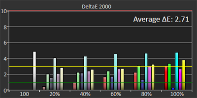
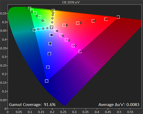
Jumping into the Pixel 2 XL's default Boosted color profile, we can see that it nearly covers 110% of the sRGB color gamut on the CIE 1976 u'v' chromaticity diagram. The near-100% intensity reds still seem to be lacking relative to the boosted color profile. That being said, 100% red on the Boosted color profile does have a larger, more noticeable chromatic difference ΔE = 3.01 than it does on the Natural color profile (ΔE = 1.34), though the red's lighter appearance in the Boosted profile compensates for its too-dark appearance in the Natural profile. Measuring against the normal sRGB gamut, the Boosted color profile has an average saturation color difference ΔE = 2.71, which is higher than in the Natural color profile (as expected).
Overall, the Pixel 2 XL’s Boosted color profile is a good way to slightly increase the display’s vibrancy while retaining accuracy. The main issue is that the increase in saturation isn’t uniform, with the yellows and greens exhibiting the most perceptible increase in vibrancy.
Saturated Color Profile
Google hasn’t explicitly mentioned that the Saturated color profile is calibrated to the DCI-P3 color gamut, but it has stated that it puts the Pixel 2 XL in its native display gamut, and the Pixel 2 XL spec sheet implies that it covers 100% of the DCI-P3 color space. Its native gamut must be DCI-P3 or one that's larger, so we will measure it against the DCI-P3 color gamut.
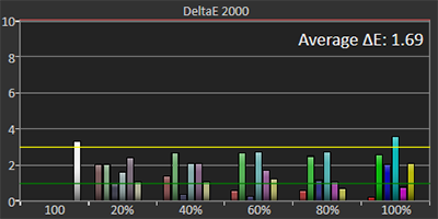
We can see that the Pixel 2 XL’s native display gamut fits the DCI-P3 color space with an average saturation color difference ΔE = 1.69, which is more accurate than its Natural color profile’s average saturation color difference (ΔE = 1.78). This mode is finely calibrated, with only two color target values having a color difference ΔE above 3: The white point and 100% cyan. The rest of the measured colors have nearly unnoticeable differences, and the colors on the Saturated color profile aren't darkened, but lightened. Most colors will appear slightly lighter on the Pixel 2 XL's display, but the blues will not.
OLED Weaknesses
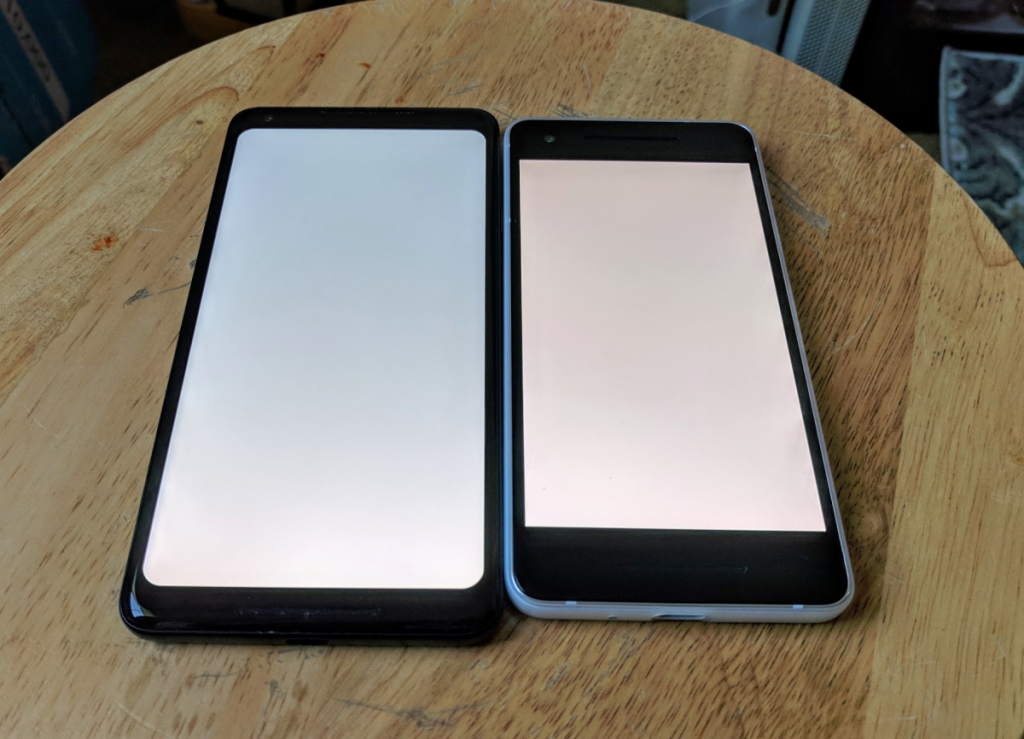
One of the shortcomings of cavity-based OLED displays is their white angular dependence, which causes the display to shift color and brightness at different angles. On our Pixel 2 XL unit, the display lost little light when tilted at an angle, but experienced a severe case of angular color shifting toward blue when viewed away from perpendicular.
The color shifting on the Pixel 2 XL is much worse than that on the Pixel 2, which has an OLED display manufactured by Samsung. The two phones use different OLED design patterns to tackle angular color shift, with the Pixel 2 XL’s LG panel LEDs gradually shifting into a different color as it is being viewed away from perpendicular, and the Pixel 2’s Samsung panel alternating the color shift between red and blue, increasing in severity as it is being viewed away from perpendicular until it is completely "rainbowed out" near parallel.
Pixel 2 XL (left), Pixel 2 (right)
Another weakness of OLED displays is that their individual diodes take longer to turn on than they do to switch off, with the blue subpixel being the fastest to light up. This causes a ghosting, jelly, or “black smear” effect when a low-luminance color is moved around a black background or vice-versa. Our Pixel 2 XL unit exhibited normal levels of ghosting, comparable to the Note 8.
[video width="360" height="640" mp4="https://static1.xdaimages.com/wordpress/wp-content/uploads/2017/12/VID_20171126_175636_2.mp4"]
Note 8 (top), Pixel 2 XL (bottom)
Display Comparison
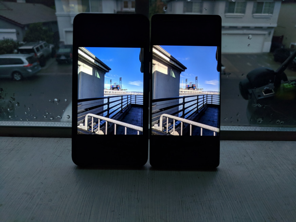
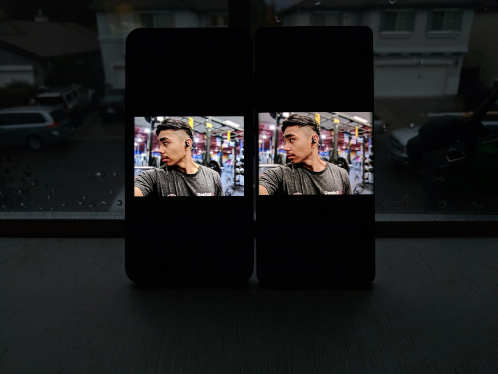
When comparing photos of the Pixel 2 XL and Note 8's displays side by side, they appear to be very similar at first. However, the temperature differences immediately become apparent. In the comparison above, the Pixel 2 XL’s colder temperature is very prominent in the blue sky and water; the Note 8’s warmer tone dials them back a bit and exaggerates the sun’s heat by the highlights on the top-left and the railings on the bottom. Neither gets the photo exactly correct—the Pixel 2 XL is too cold and the Note 8 is too warm—but the Note 8’s less-punchy profile renders this photo more accurately.
Moving onto this immaculate portrait selfie, the effect of both displays' temperatures on skin tones is noticeable. Colder temperatures will make skin tones appear pale, while warmer temperatures will make skin appear richer in color. The human eye is very sensitive to skin tones, and once again, neither display gets the photo completely right—the Pixel 2 XL makes skin appear too pale, and the Note 8 makes it too warm for lower skin tone intensities. The Note 8, however, is the more accurate of the two.
Here are some more side-by-side photos:
The Pixel 2 XL renders photos very accurately overall, although slightly colder due to Google’s insistence on making the display feel “fresh”. When sharing media with friends, most displays do tend to have colder white points, so you can feel secure in knowing that the grayscale will appear similar, and that others viewing it within the same color space (which are almost all computers and laptops, and iPhones) will see the same photo.
Conclusion
Although Google has made some questionable decisions in tuning the Pixel 2 XL’s display, it is indeed well-calibrated and accurate in its Natural color profile—it’s more accurate than most HDTVs, computer monitors, and many smartphone displays. Most of the color errors are unnoticeable in non-diagnostic conditions, with many being completely imperceptible. The intentionally-colder tone is, hopefully, something that Google can address in a future update for those that do not prefer colder displays. However, some of Google’s user interface design decisions, along with the darker gamma, can make it difficult to convince people that the Pixel 2 XL is using the same color profile as Apple’s iPhones. Some of these design decisions include the white gradient applied to the bottom of the Pixel 2 XL's native launcher, and its small app icons. Apple’s iPhone home screen appears much more colorful due to their larger app icons and icon shape (rounded squares have a higher fill rate than circles), which use less white space and more distinct colors than Android’s and Google’s app icons.
The Pixel 2 XL’s native gamut in the Saturated color profile is accurately calibrated to the DCI-P3 color gamut, so we can expect the device to render wide color properly when more Android applications are color managed (of course, when using the Saturated color profile to superficially make colors appear more vivid, that won't matter). There's a substantial angular color shift toward blue, more severe on our unit than on competitors' displays. However, many users have posted photos of their units that don't exhibit as much of an angular color shift, so it may ultimately come down to a quality control issue that perhaps Google and LG can tighten up in future-generation OLED displays. The upside to LG’s panel is that it exhibits little angular luminance shift, and that it does not rainbow out at extreme angles like Samsung’s do—once the display reaches its maximum color shift, it appears perfectly uniform until parallel, whereas Samsung’s display would be illegible far short of parallel. Minimizing this color shift would be ideal, and improvements could make it superior to Samsung’s current color-shifting solution of varying the hue and severity of color shift.
Our unit also exhibited minor display grain, noticeable only when observed at a close distance from the display. This also varies unit-to-unit, so it might be remedied with tighter quality control.
Our Pixel 2 XL unit displays also feel hollow, producing audible sounds that are louder than usual when the top glass is tapped or touched. This is due to excessive air being trapped under the glass, which can be caused by poor screen adhesion when the OLED screen is laminated to the smartphone chassis. This air pocket acts as a vessel for sounds and vibrations, causing audio from the speakers to vibrate the screen with greater feedback than on a tightly-fitted screen. The Pixel 2 and most other current-generation smartphones do not have this issue, but most older devices do. We speculate that this design flaw is possibly an oversight by Google’s first time working with 3D Gorilla Glass and shaping OLED displays.
The display gamma is arguably the most conflicting aspect of the Pixel 2 XL's display calibration, as it renders many tones darker than what most users are used to. As a mobile device the display gamma should be lower or dynamic. The higher gamma of the Pixel 2 XL can make viewing media in the sunlight more of a challenge, even though the display gets adequately bright. Once again, the display gamma, along with its improper transfer from the display’s native gamut to sRGB (resulting in black crush), can all be changed in software—it just depends on whether Google finds enough of a reason to do so.
Whichever display issue is most bothersome is personal to the user, some of which can seem overwhelming for a phone this expensive, but the same reason to buy Google’s phones—their software—is also the bulk of the issues here, so make sure to let them know!

