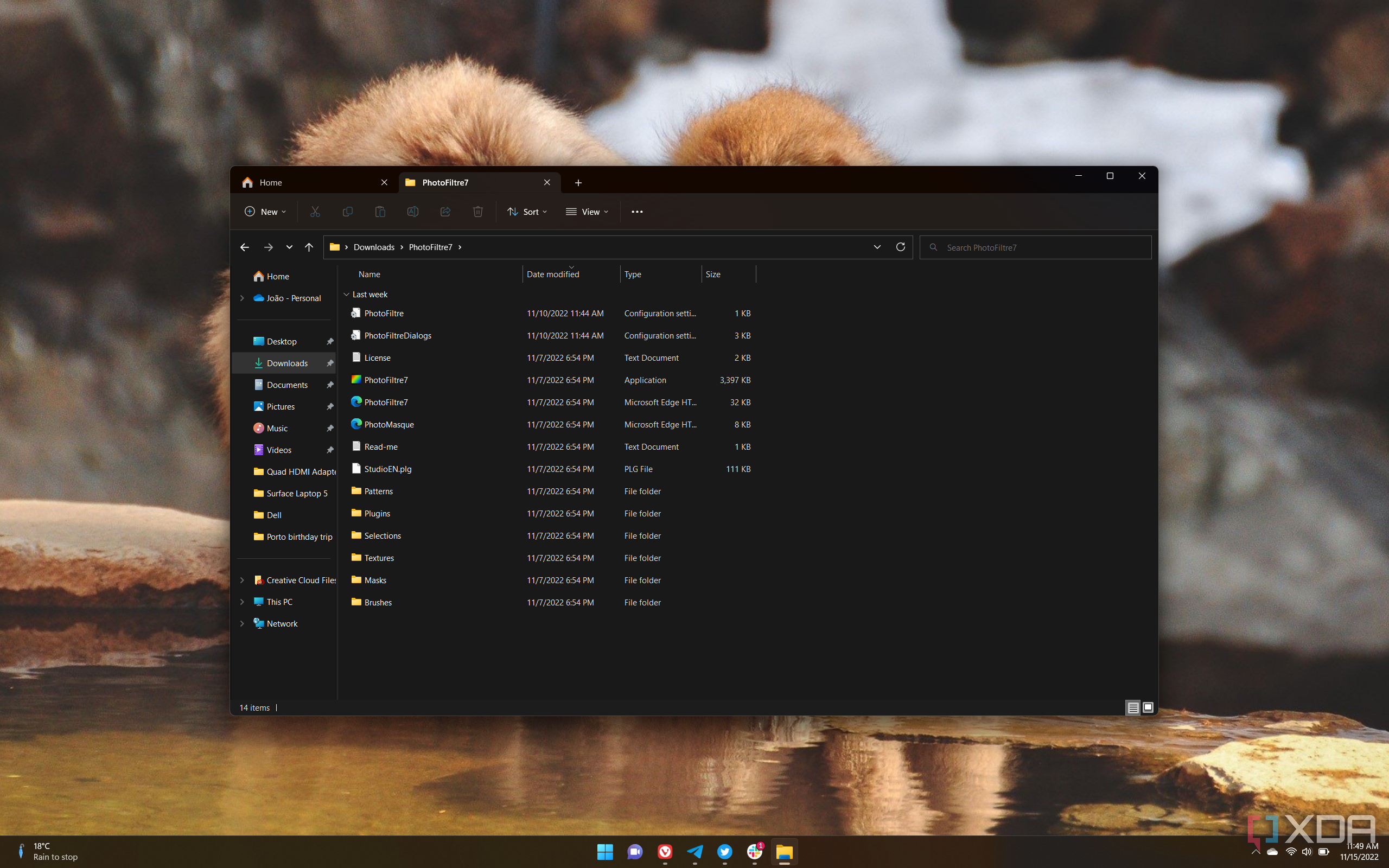
Microsoft is working on a big update for the File Explorer in Windows 11, bringing with it a modernized design and additional features. This is on third round of significant changes bein made to File Explorer, after the initial Windows 11 release, and then the addition of tabs in the first "moment" update for Windows 11 version 22H2.
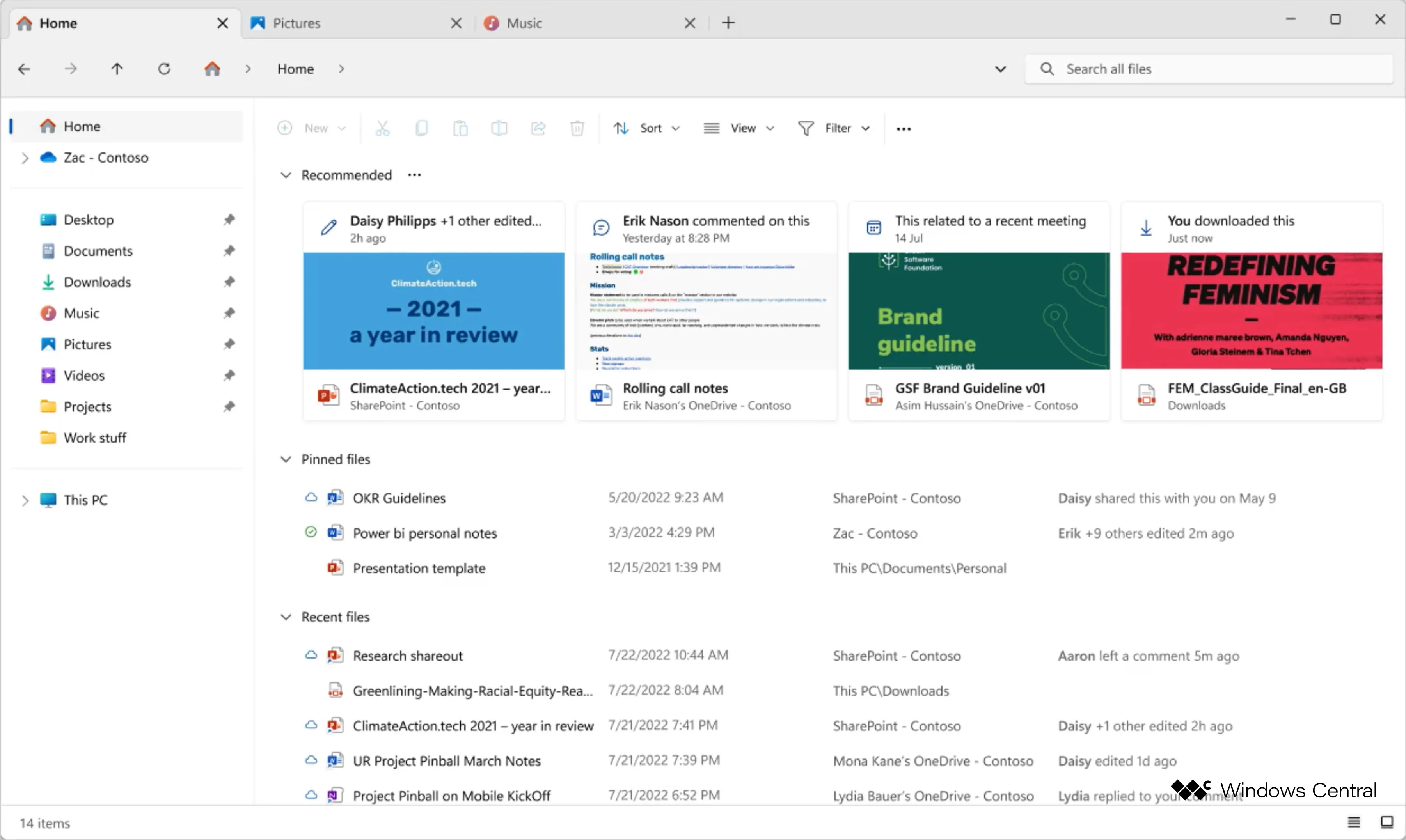
The information comes from Zac Bowden of Windows Central, and the report comes with a look at some of the upcoming changes. One of the first things you'll notice is the new Recommended section in the Home screen, which ties into broader plan to integrate Microsoft 365 more deeply into the experience. Recommended files are pulled from SharePoint and OneDrive locations, and they're shown with large thumbnails so you have a clearer view of the files that are being recommended.
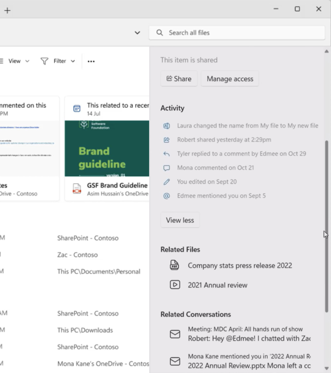
This integration goes deeper, too, as the Details pane for a file is also being modernized to show even more information. You'll be able to see recent activity on shared files, as well as recent comments on a file, whether that file is shared through the cloud or via email. One of the images shared also shows a section for related files, which give you more context for a specific case you may be working on.
Another change, although we don't have a look at this one yet, is a new Gallery view that's being added to File Explorer to make it easier to browse and view pictures. According to the report, you'll be able to hover over a photo to see a larger preview of it. Microsoft is also apparently considering adding tags to files, similar to how macOS works, making it easier to organize files.
On the aesthetic side, of course, there's the new Details pane seen above, which looks cleaner and more modern. But other aspects of the UI are changing. The navigation bar now lives just below the title bar, and it looks more streamlined, too. The address bar blends into the background, so it doesn't stick out as much, while the search box has a more modern look with rounded corners. With this change, file-related actions like creating a new folder, copying, or cutting, have been moved into the main view of File Explorer, closer to the files themselves.
According to Bowden, the new design for the File Explorer is planned to be rolled out before the end of the year, so Windows Insiders should get a look at it at some point in the coming months.
Source: Windows Central


